
After years of modifying their core algorithm to favor mobile-friendly sites, Google is finally ready to take the next step: mobile-first indexing.
Google announced last week that starting July 1, 2019, all new sites will be indexed mobile-first. Existing sites will be notified in their Search Console when their site will transition to mobile-first indexing. So what is mobile-first indexing?
Google works by sending “spiders” to crawl the web (don’t worry, arachnophobes, they’re really just virtual bots). When they find links on a page they multiply and follow the links, then multiply on the destination page to follow those links, and so on and so forth, on a quest to find and catalog, or index, every page in existence. Historically, the spiders crawled through the desktop version of the page, but with mobile-first indexing, they’ll now be crawling the mobile version of the page. In short: Google is ranking your page based on how it renders on a cell phone, regardless of whether your customer ran a Google search on a desktop, laptop, tablet or phone.
This announcement really comes as no surprise, as every year people spend more and more time glued to their smartphones, tablets and wearables. What’s more of a surprise is that many businesses waited until now to begin optimizing their online practices, content and websites for the mobile explosion.
Search engine optimization is often one of those buzzwords that can sound overly complicated and includes complex theories filled with confusing technical jargon, but in reality, the rules can be quite simple.
The goal of a search engine is to deliver results that are the most relevant and the best equipped to answer a user’s search query. The search algorithms, or crawlers, are designed to emulate how a human visitor would interact with your site and in many cases, optimizing the user’s experience of your mobile offerings can yield better search results.
While there are certainly technical aspects and a plethora of design changes to consider when implementing a mobile search strategy, you should aim to take a logical step-by-step approach to avoid becoming overwhelmed. To be better equipped to tackle your mobile SEO challenges, consider the following mobile elements and SEO resources.
Mobile-Friendly Website SEO Best Practices
The following are mobile-friendly SEO best practices and considerations to keep in mind while optimizing your website and content for mobile. Take note that not all of these elements are correct for every business; you should focus on the tactics that best align with the current state of your mobile efforts.
Design for Performance

It’s important to consider that your mobile visitors are likely limited by their devices. Often, when searching on a mobile device, your visitors are working with slower computing power, a diminishing battery life and a slower internet connection.
All of these factors may weigh in the back of the user’s mind and can increase their likelihood of being in a hurry. If your website takes too long to load or they can’t find the answers to their search queries quickly, they will likely leave your site for another.
The key to designing your website for performance is minimizing the stress your site places on the user’s mobile network while also improving the user’s chances of finding what they need quickly. By using smaller image sizes and lower-quality videos you can decrease the amount of data the user will need to load, which can better ensure that your site operates quickly. However, be careful not to decrease the quality too much and create a worse experience for users with faster connections.
“If your mobile site has less content than your desktop site, you should consider updating your mobile site so that its primary content is equivalent with your desktop site. This includes text, images (with alt-attributes), and videos – in the usual crawlable and indexable formats.” – Google
Instead, incorporate mobile-friendly options for your content when possible. For example, if your website offers high-quality downloadable content packaged in a large file, give the user a variety of other file size options to choose from, such as a mid- or lower-quality option. This allows your audience to decide which content works best for their device’s limitations, and more importantly, helps you cater to users with both slower and faster mobile devices.
Focus on User Experience
 Focus on User Experience
User experience is not only important for the happiness of your visitors, but it can also lead to improving your mobile SEO by increasing some of the technical factors search engines look to understand if you’re offering an enjoyable experience to your visitors (this can include things like a quick load time, easy-to-use navigation, proper redirects, clean URLs and more).
The idea is that a website functioning properly and providing value to your audience is more likely to rank higher in search. To improve the user experience of your mobile website, content or other offerings, consider the typical paths you’d like your visitors to complete on your site and perform an audit of how your current site operates. Document any content, pages, forms, navigation errors or other elements that can cause confusion and revise these hang-ups.
Keep the following suggestions in mind when performing your audit:
- Content should be easily readable without the user needing to zoom. Users should be able to get the information they need quickly and in one place.
- Scrolling should be vertical and not horizontal. It’s difficult to fit all of your content into a small screen and scrolling is likely; however, horizontal scrolling is not a common behavior on mobile devices and should be eliminated.
- Navigation should be intuitive and buttons should be large enough to click with big fingers. Missed clicks can be very frustrating on a mobile platform because the user will need to wait to load the wrong content and then backtrack to find what they really needed.
- Form submissions should be short and to the point; remember, users on a mobile device are often in a hurry and won’t generally stick around long enough to submit large forms.
Note that some elements are now considered outdated or can’t be properly optimized for mobile and you should consider removing them, including:
- Adobe Flash Player is becoming more and more outdated as we speak and still can’t be rendered on many mobile devices. Any elements that disregard the needs of your visitors or alienate a particular mobile device should be removed.
- The plug-ins that are designed only for desktop can cause hang-ups, device crashes and security issues in mobile browsers.
- Pop-ups and interstitials can be a nightmare for a mobile user. Some pop-ups can be very difficult to close on a small screen which can cause frustration for the visitor, not to mention slow them down when they’re trying to find their answers. Proceed with caution when using these elements on mobile.
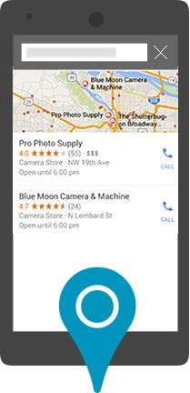
Optimize for Local Search
Research shows that the majority of “on the go” or mobile searches have local intent. Essentially, when people are looking for businesses or products, they’re interested in results local to them. If your business has any local elements, it’s important to leverage these search habits and optimize your site accordingly.
Mobile searchers are commonly looking for the exact location of a particular business, their hours of operation, and their price and availability of a product. Google’s algorithms have grown to understand the needs of mobile searchers and rewards sites that have the most current and relevant information optimized across devices.
To optimize your mobile SEO for local search, you’ll need to understand the intent of your audience and what they’re expecting to find when searching for your products or service offerings. This information can help you choose better keywords and include the correct information in your metadata and content.
Start by including your company name, phone number, business hours and full company address into your site’s metadata and within a contact page on your website using schema markup. Full address meaning city, state, country and the ZIP codes that your business serves. This helps search engines better understand where you’re located and can increase your chances of appearing in a local search.
For example, if a photographer was traveling through Oregon and looking for new camera gear or a film developing lab, their search query may look something like, “film developing near me” or “photography shop in Portland.”
To further your local efforts, join local community groups, pages and even local chamber of commerce chapters. These organizations can help your brand become more credible within the communities where you operate, and also provide link-building opportunities that can improve your local SEO. In addition, you can increase your SEO presence by submitting your information to the search engines themselves, as well as different citation and review sites such as, Google My Business, Bing Places, Yelp, Angie’s List and other local citation sites.
Inform Google That You’re Mobile: Design Element Considerations

When Googlebot crawls your website, it looks for unique code snippets that identify whether or not your website is mobile friendly. It’s scanning to see if your mobile site uses a responsive, dynamic or a separate URL for mobile users. Each requires different technical code for Google to properly index the site; neglecting this code could negatively affect your search rankings.
Responsive Website Design
When your site is using a responsive mobile design, Google can crawl your content without requiring you to create any additional code. Google is looking to see that your website is correctly setting the viewport for your visitors, which is typically included in the code when your site is using a responsive template or theme. Basically, the viewport is the code that tells a mobile device how to best display your web page or content based on the specifications of that particular device. For example, a properly set viewport will render your content correctly on Apple devices, Android devices, phablets, tablets, etc. Google recommends using responsive design.
Dynamic Website Design
Sites that use dynamic designs render different content to desktop users than to mobile users. Google can’t immediately detect when a website is using dynamic content and you’ll need to “hint” to Google that you’re still delivering a mobile-friendly experience. To accomplish this and optimize a dynamic design for mobile SEO, add the Vary HTTP code to your site’s header. This code signals to a user’s device that your content should be loaded according to their device’s specifications and can also help Google find your mobile-optimized content faster.
With the mobile-first indexing, Google will crawl the mobile-optimized content. To prepare, they recommend following their best practices.
Separate Mobile Website
When a business uses different sites for desktop and mobile users, the coding for SEO can become much more complicated, which may be why this design format is falling out of favor, and as we mentioned earlier, Google values when mobile and desktop experiences have the same content.
To identify a site that uses a separate mobile website, look at the site’s URL. A mobile-only site is generally indicated with an m.domain or mobile.domain URL.
Again, Google will not automatically detect that you have a mobile and desktop version of your site. To properly optimize this design for your mobile SEO, you’ll need to guide Google’s crawlers through your site by including code that connects your pages and content. Google recommends using annotations on your desktop webpages and canonical tags on your mobile pages to point its crawlers to the correct content.
This process can be particularly complicated for businesses with a big website or a large collection of content or pages to index. Consult with your webmaster for tips on implementing separate mobile sites correctly, but our recommendation is to opt for a responsive design.
Want more? Download our Landing Page Best Practices checklist.
Every landing page should check these 10 boxes before going live.
Ultimate Tools Checklist for Mobile SEO
When determining which mobile SEO strategies will work best for your business, it’s important to research a variety of sources and gather as much information as possible prior to creating any new initiatives. The following is a checklist of some top-notch resources to help you further dive into the mobile SEO strategies presented in this article.
Mobile Testing Tools
-
- Google Mobile-Friendly Checker — This quick test allows you to gain insight into how Google views your mobile content and offers suggestions on how to improve any errors.
- Google Mobile SEO Overview — Google has compiled this guide to help you understand how to configure your site for multiple devices, inform the search engines of your mobile presence and help you avoid some common mistakes while implementing.
Technical SEO and Mobile Ranking Factors
-
- The Definitive Guide to Technical Mobile SEO — This article from Search Engine Land can help break down some of the more technical aspects of SEO.
- Google’s 200 Ranking Factors — Brian Dean from Backlinko keeps an updated list on Google’s ranking factors and how important each element is when ranking your website. There’s also a great checklist you can download from this guide to help you avoid missing steps when prioritizing SEO.
SEO Keyword Planning
-
- Google Keyword Planner — This tool can present the historical statistics and traffic forecasts for your keywords and is often the first tool an SEO specialist uses. Also, it’s a great resource when planning what content your audience is primarily interested in.
- The Definitive Guide to Keyword Research [e-book] — From long-tail keywords to competitive keyword analysis, this e-book has a great mix of detailed how-to and technical explanation with seven chapters of content.
- The Guide to Keyword Research — When it comes to SEO, Neil Patel produces some of the most comprehensive analysis available.
Mobile Design Tools and Templates
-
- Google Design Fundamentals — Google wants to make it as easy as possible for websites to comply with their new mobile-friendly search requirements and this guide offers detailed insight into: home page and site navigation, site search, commerce, conversion and proper form entry practices.
- WordPress, ThemeForest and Template Monster — These template resources can help alleviate the need for heavy coding when designing a mobile-friendly website. In addition, they offer a variety of responsive and dynamic templates for e-commerce websites, which can be more complicated to design.
SEO Strategy and Planning
-
- How Much Does Good SEO Cost – This article breaks down the cost of hiring an agency, freelancer and in-house team for your SEO.
- How to Create a Successful SEO Strategy — This guide discusses the key components of SEO: strategy, conversion, content, optimization, authority and trust.
- The Advanced Guide to SEO — This guide includes real-life examples, detailed screenshots and nine comprehensive chapters to further advance your SEO knowledge.
Apply This to Your Business
Not any one strategy or tactic is correct for every business and there’s never a guarantee that Google or other search engines will rank your site higher. But by incorporating the techniques presented in this article, you can be better prepared to improve your SEO efforts.
Search engines aren’t out to make your SEO work more complicated, they’re simply trying to deliver the best possible experience for their users, something that should be a top priority for your business as well. By punishing a website or content that’s not up to par on both desktop and mobile devices, search engines promote a competitive environment, driving many businesses to improve their online presence and user experience for their customers.
If you need help preparing for mobile-first indexing, please don’t hesitate to get in touch.
Originally written by Brian Honigman and published May 19, 2015. Updated by Kevin Chow on June 4, 2019.