Is your site guilty of any of these 10 conversion-stoppers?
Getting qualified traffic to your website is only half the battle. The other, most important half, is transforming that traffic into paying customers once they get there — compelling users to buy via website conversion optimization.
That’s gonna be an uphill battle if your site doesn’t follow CRO best practices.
The cost of a bad conversion rate can literally mean millions in lost revenue.
There’s a myriad of crimes against conversion that appear across the web, on small-budget sites to even the most-trafficked. These are the worst offenders that destroy profitability and repel visitors.
From bad copy to distracting design, here are the top 10 conversion-stoppers you should avoid at all costs (and conversion optimization tips for what to do instead).
#1: Awful Words and Phrases
Words matter. It only takes a few seconds for visitors to make their mind up about your brand. Those moments mean the difference between exit and conversion.
If you’re scattering meaningless and sometimes awfully negative words throughout your website — you can kiss any chance of sales goodbye.
Visitors scan before they read. Numerous studies have found the most subtle of variations in text can actually have huge psychological impact. When the variations are positively focused, they lead to improved conversion rates.
However, if you are using these vague, “scammy,” dull, and/or pessimistic words or phrases in your sales copy — replace them immediately!
- Submit (to what???)
- Learn More (Also: “Discover”)
- Synergy (cringe!)
- Spam (negative signals)
- Best of Breed (bigger cringe!)
- Click Here (be descriptive instead)
- Save Time & Money (not exactly a unique sales proposition)
- No Hidden Fees (now I believe there are!)
- We (make your sales copy about them — use “You”)
- Your (in CTAs, use “My”)
Also, be careful using the word “free,” as visitors can become dubious when this word is overused. Sometimes it works, sometimes it doesn’t.
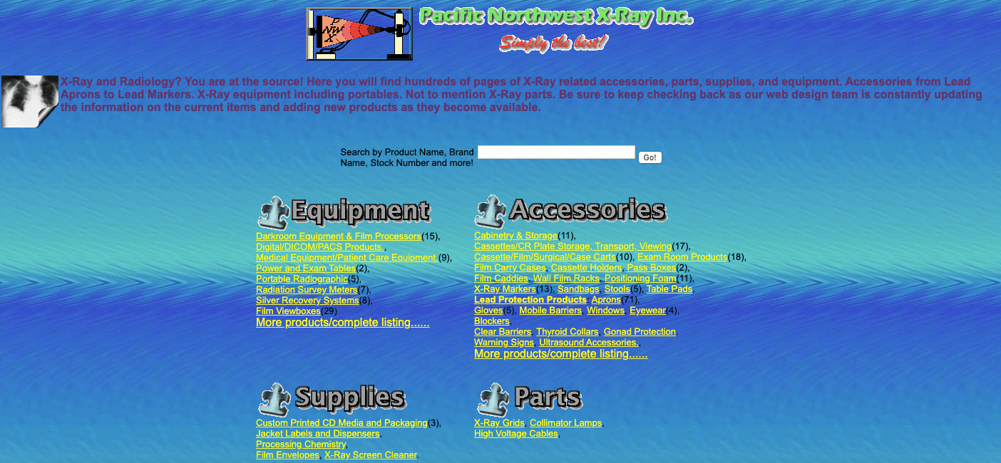
#2: Shocking Web Design
Yes, it still exists all around us…the appalling side of the internet. Although on this occasion, I’m not talking about the Dark Web. I’m referring to frightful websites that should be banned for bad web design.
Unfortunately (and somewhat astonishingly), there are many websites that seem to have become trapped in time — which from certain examples, seem to be somewhere back in the ‘90s.
Bad website design instantly tells visitors you don’t mean business. After all, if you don’t care about your own credibility, you’re probably not going to care about theirs (which is exactly what they will be thinking).
Such crimes may include:
- Lack of mobile functionality
- High-contrasting colors
- Multiple calls-to-action
- No information hierarchy
- Complete overload
- Design over function
The following example may be extreme, yet even sites that appear to be easy-on-the-eye can be so badly designed in terms of usability. The result? No conversions.
Don’t try to be too clever and follow all the latest design trends, either. Parallax scrolling design, for example, can work very well … or it can destroy your conversion tally completely (as well as cause complications for SEO).
Clean, minimalistic web design is often a safe bet to ensure visitors turn into customers. It takes much less planning, too.
Remember these points as essential guidelines:
- White space
- Simple navigation
- Personal About Us page
- Contact information
- Call to action
- Search function
- Informational footers
- Styled buttons
- Custom imagery / iconography
- Attractive typography
Just make sure your navigation is 100% efficient. Your visitors want to get to places in one to three clicks, at all times.
When it comes to usability, always keep your own opinions out of the equation – that includes everybody in your company. The chances are that you are so ingrained in your own website that decisions on design are biased by familiarity.
Gain real feedback by installing user surveys and using heat map tools, like Hotjar. Test user behavior on a deeper level using VWO or just hire CRO specialists to do it all for you.
Most of the points in this article relate in some way to web design. Ensure you have your foundations right first in terms of core design. Then, work on the rest.
#3: Sliding Banners
There is plenty of evidence against sliders (or carousels, as they are known). While it would seem that fitting several marketing messages into this space would be brilliant, offering too many messages can be overwhelming to your visitors. Seriously, these website additions are some of the worst conversion-killers around!
(Source: shouldiuseacarousel.com)
It’s a better idea to use static banners. However, when there’s too much debate in your large company over what should be shown, apply dynamic personalization to aid continuity and display an image with a CTA that’s pertinent to the website from which your visitors have arrived.
Cleverly, this means you can present variations of pages for each of your campaigns, just like you would display different landing pages for traffic from ads. Promote or apply unique URLs for each marketing campaign. Also, ensure you use canonical tags to declare any duplicate content — and stay in Google’s good graces.
If your budget permits, there are many marketing automation tools that enable personalized banners and more, targeting visitors based on their past behavior and how they arrived. One study found personalizing sliders increased clickthroughs by more than 20 times.
#4: Making It Difficult to Purchase
The goal of any website is to provide a seamless experience for visitors so:
1) They enjoy it
And
2) They buy from you
This means removing any barriers and other distractions that conflict with those points. It’s common sense — yet the internet is filled to the brim with websites that don’t offer such experiences.
Some typical examples of painful obstacles:
- Annoying ads
- Intrusive pop-ups (which you definitely need to remove now, for SEO)
- Irrelevant content
- Forcing visitors to register and confirm their details via email before purchasing
- Not using cookies to remember their details
- Taking visitors back to the beginning of a blank transaction form if they make an error
- Making them click through 10 unnecessary pages before arriving at their destination
- Dysfunctional search bars
- Omission of common payment platforms
- Unclear call-to-action
- Multi-colored CTAs
- Incorrect implementation of translated pages
#5: Unclear Call to Action
Too many business owners believe their website is brilliant purely because it’s theirs and they like the layout. Test, test and test some more until your users prove it’s a good website by taking the desired action.
It could be said that 9 times out of 10, people don’t visit your website simply to admire its design perfection. One report found 96 percent don’t visit to buy, either. It’s your job to convince them otherwise via a website that’s built to convert traffic into sales.
Developing a clear CTA will tell visitors exactly what to do when they land on your website. That could mean buying a product, hiring your services, enquiring for additional info through a form or subscribing to your newsletter — to name a few.
If you’re telling your visitors to take 101 diverse actions through 101 different colored buttons, none of them are going to end up taking any action at all.
(Source: WordStream)
Keep it simple and focused!
#6: Sluggish Load Times
A slow-loading site is highly irritating. In a time where immediacy is expected, you simply cannot afford to present a slow site to your visitors. They will leave.
Research conducted by Kissmetrics found a 1-second delay in page response can lead to a 7% reduction in conversions.
Not only that – research shows slow sites correspond with lower overall engagement (up to 40% of visitors will leave if a site doesn’t load after just 3 seconds). If you want to convert your visitors, make sure your website is quick to load.
Going a step further — you also have the option of instant pages using these hot technologies:
- AMP (Accelerated Mobile Pages)
- PWA (Progressive Web Apps)
- AML (Accelerated Mobile Links)
To regularly test your website speed and keep you out of conversion-killer prison, manually check your site on a variety of devices and use tools like Google PageSpeed Insights, Pingdom and GTmetrix.
Slow site speed can arise from using too many plug-ins and scripts. An advanced tool for analyzing scripts is GTmetrix.
Also, shared hosting is a culprit of cumbersome load times. Ideally, you want a VPS or dedicated server. The price tags are indeed worth it!
#7: No Trust Signals
Trust is increasingly important in today’s world of hacking, scams and fakery. People are more aware now than ever before. Do your visitors trust your website?
(Source: Moz)
If you don’t portray and earn trust, your sales are going to suffer. To circumvent this, it’s essential to understand what exactly makes a website trustworthy.
An SSL certificate is a major trust signal. With the highest-level version (extended validation SSL), you must proceed through a stringent validation process before you earn the padlock, seen on the toolbar of all reputable e-commerce stores.
Even if you don’t own an e-commerce store, it still helps to buy an SSL for your domain. Otherwise, the words “Not Secure” will pop up in the toolbar when people are visiting your non-HTTPs site. Google will warn visitors about a non-private connection where attackers might be trying to steal your information.
Social proofing is another massive indicator of trust:
- Testimonials (especially videos)
- Case studies
- Partner + client logos
- Press coverage
- Years served
- Social media profiles + comments
- Awards
- Revenue
- Total customers
- Customer feedback stats
“Inc.” reports 84% of people trust online reviews as much as personal recommendations. Word of mouth is immensely powerful for marketing.
You need to gain the complete trust of your visitors, clients and/or customers at every touchpoint throughout the buyer journey. Add security signals and social proof to your website ASAP to avoid killing your conversions!
#8: Your Website Lacks a Human Touch
Your visitors can see the products on your product pages. They can read the features and specs. But can they actually see how purchasing these products will make them feel?
Face it. Whether you like it or not, most purchases are actually based on emotions.
If you really want to tap into those emotions and increase your conversion rate, show your visitors how other people feel using your products or services.
Take a look at the image below. Human Touch could just as well have showcased images of their recliners. But doesn’t the woman sitting in that chair look cozy and relaxed?
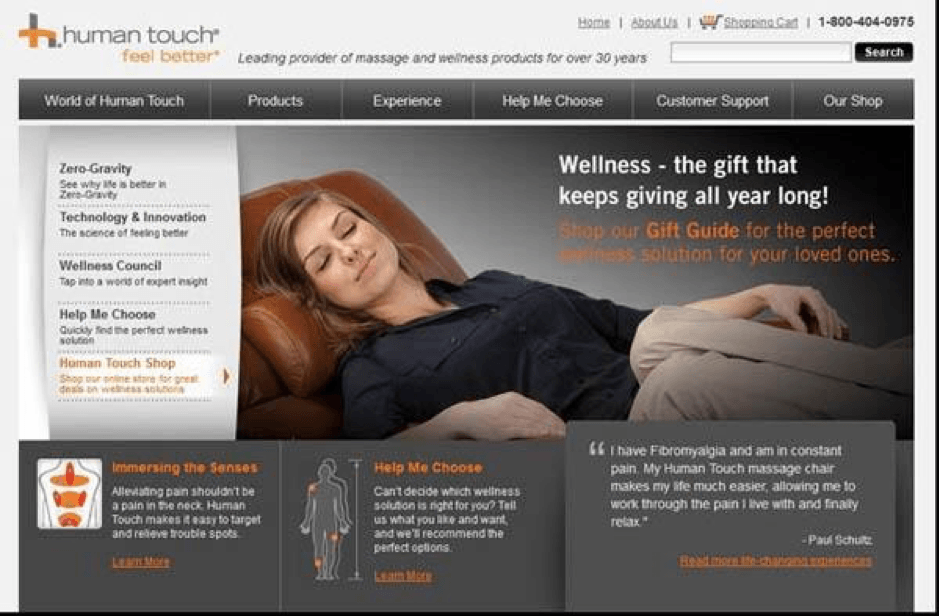
Don’t you want to feel the way she does?
Or those families that you see laughing and enjoying their vacation on the beach. Would it create the same effect to just show travel spots when selling vacation packages?
These emotions can be conveyed really well in the faces and body language of the images of people that you include on your website. Without them, your products and services could feel a little flat.
We’re all human. And our best interactions come when other humans are present in some form.
Images of people add a little bit of company to what would otherwise be a lonely online shopping experience. They help to convey emotions, to add credibility, to showcase products and to get us familiar with the people behind a business.
When used appropriately, images can really draw visitors into your marketing message. So if you’re leaving images of people out of your website’s marketing mix — you’re really leaving your very shoppers out of the equation.
#9: You’re Using a Hamburger Menu
The menu derives its nickname from the fact that it appears to look like a hamburger patty between two buns:

The thought is that it creates good use of space. The problem with this thinking is what if your visitors don’t know what it is? What if they don’t click it?
The main navigation bar is the central hub to your entire site. It’s what helps your visitors find what they are looking for and get around your site.
If you hide this important piece behind a hamburger menu icon, you’re risking that they will never see your navigation menu at all.
What could that mean to you? Possible lost sales.
The hamburger menu isn’t a complete design faux pas. It may have its purpose, if used in the right way.
Mobile site designs do very much need to make the most of the little space that is given to visitors. So consider testing its use here. However, it is recommended that you do at least include the word “Menu” so that visitors will know what this icon represents.
#10: Your Menu Is on the Left-Hand Side
Now, this isn’t a newer design element. In fact, it’s really pretty old. A lot of sites were using left-hand navigation bars a decade ago.
Just take a look at the heat maps below, which reveal that very little focus is given to the left-hand menu.
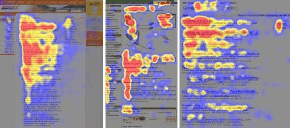
As you can see, most of the focus is given to the main content and the main navigation menu bar above it.
This comes as somewhat of a surprise considering a left-hand menu bar would seem to enhance navigation with a secondary set of choices.
But that’s the problem. Sometimes too many choices can be overwhelming to visitors. They may just be tuning this menu out and focusing on their primary goals.
Another thought is that using it creates a columned effect to the web page. Columns can break up the flow. You’ll see a lot of sites these days using the entire layout of a site from left to right with no columns whatsoever.
If you think breaking design up into columns doesn’t have an effect, guess again. Even the smallest creation of columns in a form can slow down visitors.
But again, this is something worth testing. There are many e-commerce sites that use a main navigation menu along with a secondary left-hand menu bar that lists all of their products beneath a product category.
Now that you know the 10 worst conversion-killing crimes you can commit with your website, you can begin to fix them.