Save the expense of an in-house designer and follow this step-by-step guide to creating consistent visual content optimized for social media channels.
Standing out on social media today is no easy task.
One of the most effective ways of making an impact and generating more engagement with your social media content is by including compelling visuals.
Articles that include an image every 75 to 100 words receive double the social media shares as articles with fewer images, while tweets with images earn 150 percent more retweets and Facebook posts with images see 2.3 times more engagement.
Visuals can also help make your social content easier to recognize when regularly incorporated with your messaging, developing a clearer memory of what value your company offers.
Successfully creating visual content requires a systematic approach to ensure they drive the results you’re looking for, while keeping in mind your limited time, resources, and budget.
Most companies don’t have a professional designer on staff or can’t afford to outsource design, but luckily there are lots of options for non-designers to create visuals for free or at a low cost.
Use this step-by-step process to create one-of-a-kind visual content for social media.
What Type of Social Images to Consider
To begin brainstorming what visuals to develop for your business, here are the most popular types of images to consider designing for social media.
- Quote: Images that highlight a quote from an employee, inspirational leader, or other relevant voice where the text is the primary focal point.

- Product: An image focused on a brand’s product in use, sometimes includes text and the company’s logo.

- Lifestyle: Visual of themes associated with the company and its offerings, but not overtly focused on the product or service.
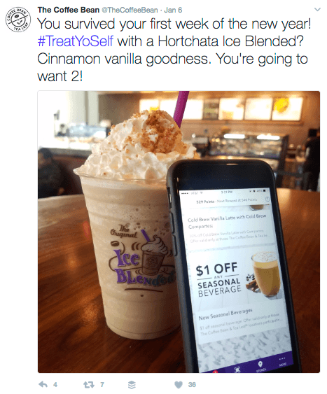
- Promotional: Visuals that include a sale, offer, contest, or another type of promotion from the company to spur sales and engagement.
- Behind the Scenes: Images showcasing a company’s staff, operations, partners, and more to help humanize the brand.

- Blog Post: An image designed to promote and drive interest for a specific article on a company’s blog.

Why Consistency Counts
Begin by developing a consistent approach to how your brand will be visually represented in social media and elsewhere.
Planning how you wish to showcase your messaging with visual content ahead of time simplifies the process significantly, as you won’t have to start from a blank canvas every time you sit down to develop a visual.
A consistent look-and-feel to all visuals shared also helps your audience recognize your social content over others, especially when it is incorporated across each marketing medium.
Before creating any visuals, develop a style guide to document the overall framework for how your company will make design choices for any visuals created.
This document should establish guidelines as to which fonts, logos, color palettes, and the types of images allowed to be consistently used in your visuals.
A style guide keeps you and your team members organized and on the same page as you’re all referring to the same document ahead of designing any visuals.
This prevents the use of too many different fonts, color, and logos, which could make an image overly confusing.
 |
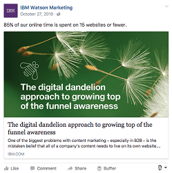 |

For example, these images from posts shared on IBM’s Watson Marketing Facebook page consistently use similar colors, fonts, logos and high-quality images to reflect the brand, making them easier to recognize by customers and also illustrating that their team relies on a style guide for direction.
Some organizations have extremely complex and detailed style guides, while others are kept simple and to the point on a Google Doc. What matters most with a style guide is that it is a useful tool that’s easy to reference on a regular basis.
There are a wide range of style guides available on Issuu to provide inspiration for your brand’s design language.
How to Select the Right Sizing for Social Images
After finalizing a style guide, determine what social channel you’d like to share an image on as it’ll dictate the direction of your design.
“What I see many brands and companies overlooking when creating visuals for social media is not taking the time to create the right image for the right platform,” says Jeff Sieh, visual storyteller and host of the Manly Pinterest Podcast.
“For example, I see a lot of companies, even very large media companies, not take the time to create a vertical, portrait-style image for Pinterest,” he adds.
“With a little time and some creative cropping, most images can be re-purposed for Pinterest [or elsewhere]. You took the time to create awesome content that you want people to share, so why miss out on all the long-term traffic that Pinterest can bring?”
Decide which social channels you’ll share images on to understand how they need to be adapted sizing wise in terms of choosing proper dimensions and aspect ratios.
Every channel has unique sizing requirements and most of these dimensions change on a regular basis.
For a complete list of what image dimensions work on each social network, bookmark this guide from Sprout Social or this one from Buffer as both are updated regularly for accuracy.
“Often businesses make the mistake of creating one image and sharing it across channels, but that may not get you the best results,” says Syed Balkhi, founder of WPBeginner.
As seen below, this image included on Twitter isn’t sized correctly for the network as it isn’t the full width of the space available within the tweet. This image is certainly aesthetically pleasing, but it would’ve performed better on Twitter if it was sized appropriately for sharing on the channel.

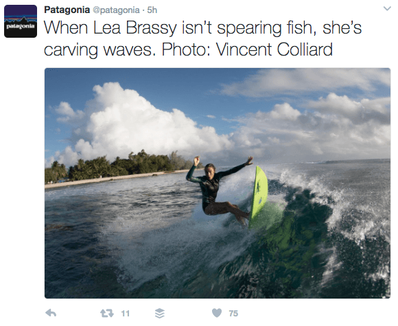
For comparison purposes, this tweet from Patagonia has an image included that makes use of the full width of the screen, which is the ideal formatting for visuals shared on Twitter.

Use tools like Adobe Photoshop, Canva, Adobe Spark, or Landscape to size your images correctly.
It takes practice to get the sizing of your images right. Create a private account solely for testing purposes on each social network where you can post your images privately first to see what they look like before publishing them on your company’s accounts publically.
The best way to size images for social is to design one for each channel, but one shortcut to sizing is creating one image with the dimensions 800 x 418 for use on Twitter, LinkedIn, and Facebook.
Since those three social networks orient images horizontally, those dimensions will adapt the image appropriately for use on any of those channels.
As a general rule of thumb, keep all elements within an image away from its edges to prevent them from mistakenly getting cut off.
Sharing an image where the text or other aspects are cut off makes them less effective at conveying your message and less professional looking overall.
Aim for Simplicity
A common issue faced by businesses making their own visuals is that they often contain too many elements within a single image, which is distracting and confusing.
Begin brainstorming what visuals you’ll need for sharing on social media and focus on simplicity as a leading element of every image.
Since you’ve got limited space to work with, establish a single focal point.

This image from Copyblogger on Twitter has a singular focus by showcasing a single headline of an article paired with a high-quality image on a plain background.
The visual is simple and informative as it illustrates what to expect from the article as the included image of the gem being inspected aligns loosely with the subject of the headline.
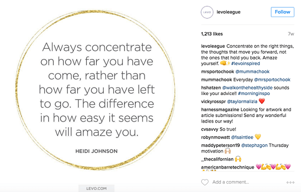
This Instagram post from Levo League is also very simple, yet still aesthetically pleasing and consistent with their brand.
The main focal point is the text for the quote, while the other elements included are helpful, but don’t distract from the image’s simple focus.
Limit the number of elements you’re including with any image for social media to quickly convey a simple message to your customers.
Allow for Whitespace
A strong visual that connects with a person has a proper balance between its included elements. To better balance the elements within a social visual, leave room for whitespace.

Think of whitespace as any open space within an image, especially in between other elements. Whitespace supports the focal point of an image and encourages your audience to continue to absorb your message.

Declutter your social media images by aiming for more whitespace to capture consumer attention and provide a sense of luxury, simplicity, calmness, and spaciousness with your visuals.
Consider Clarity and Contrast
No one area of an image should draw your attention so much that you can’t see its other aspects. The contrast of an image shared on social media impacts its clarity significantly.
“Having been a professional designer for a good number of years, the most common, cringe-worthy mistake I see is a fundamental lack of good contrast,” says Dustin Stout, co-founder at Warfare Plugins and dustn.tv.
“Contrast is a term we use for the degree of visibility between two or more objects, said Stout. For sake of simplicity, we’ll just use the most common example of an image background with a text overlay. If you have a dark-colored background and lay dark-colored text on top of it, the contrast is going to be very low.”
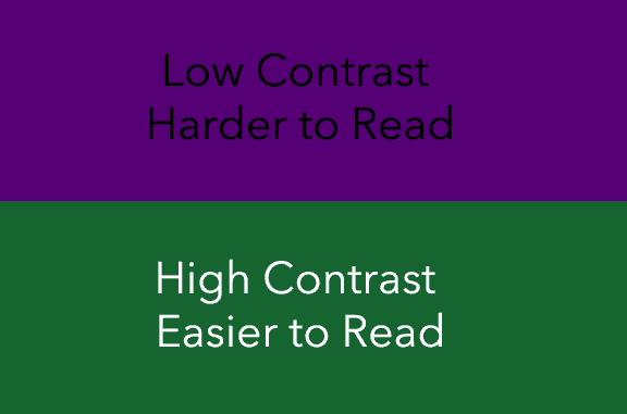
“Likewise if you have a light background with light-colored text on top of it, the contrast is going to be very low, added Stout. Low contrast means low visibility and makes it difficult for the on-looker to interpret the two objects as separate entities. Or in other words — they won’t be able to read the text because it’s disappearing into the background.”

When layering multiple elements with an image or overlaying text, choose high contrasting colors to ensure the image is clear and conveys its intended message as seen above in this Pinterest pin from Real Simple.
Prioritize Quality
Every element included in your social media visuals needs to be high quality to present your company as professional, trustworthy, and reliable.
This doesn’t mean your company needs to spend a fortune on expensive photography and graphic designers to create all your visuals, but it does mean you shouldn’t use low-quality graphics or widely used stock photos in your images.
“The most important step in the process of creating a visual for social media is making an image that people will notice in their social media feed,” says Diana Adams, tech journalist, consultant, and marketer at Post Planner.
“It sounds like an obvious tip, but I often see blurry or boring images in my stream, and I think that causes more harm than good for the personal or professional brand that shares it.
“If the image wouldn’t make you stop and look at it, it won’t entice anyone else to notice it either, adds Adams. I use that as my litmus test, and it forces me continuously create better visuals.”
When choosing stock images, only select high-quality, high-resolution images to present your brand in the best light.

Search for images from Unsplash, Death to Stock Photo, Pixabay, and New Old Stock to find a variety of copyright-free, quality images that’ll represent your brand appropriately.
To maintain the quality of your visuals, avoid including widely used stock images that you’ve seen before and that many other businesses have used consistently. It may take longer to find the right image, but it’s worth it to improve the quality of your messaging.
Another option is to take original photos with your mobile device or camera, this way you’ll be only organization sharing these particular images.
Consider doing a “photo shoot” day where your team gathers the necessary items, props, and talent for a multiple-hour session that produces enough images for social media to last weeks or months.
Paying for stock photos is an option too as it is another means of finding and incorporating higher quality, less widely used imagery within your social media messaging.
Be Original
To compete with the other content shared on social media, ensure your approach to visual marketing is original and reflects your company’s unique perspective.
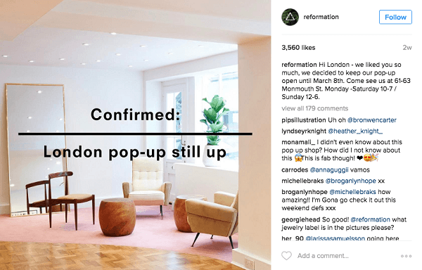
Don’t use standard fonts, instead choose modern, simple, and distinct font types that reflect your brand’s style guide.
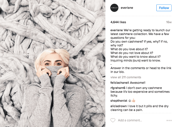
Add personality to your visuals by being bold, fresh and, experimental when deciding what elements to include. There isn’t an exact formula on how to add personality to your visuals.
Start by showcasing your opinion and stance on relevant issues with visuals, vary the type of images used on social media with everything from drawings to black-and-white photos and monitor the progress of your social content to better understand what’s working as you experiment with different visuals.
Don’t Forget to Add Context
Ask yourself: If I’m seeing this image for the first time on social media, does it make sense? Establishing a proper context within your image is essential to guarantee its meaning is properly conveyed to the intended audience at a glance.
“The most important step in the process of creating a visual for use across social media is to remember the audience you are speaking to on each platform,” says Eve Mayer, social media speaker and CEO of Social Media Delivered.
It is not easy to find the balance between providing enough context and not adding too many elements to a visual, but consider whether you’re communicating with your existing audience vs. new customers and alter your messaging accordingly.
You’re likely talking to a vast mix of consumers on social media, which requires every post provide enough context around the information being shared whether present within the image, within the text included in the image or with the copy added to the caption of the post.
“Gorgeous, engaging visuals take precious time to create so you want to maximize the use by posting on all of your platforms,” adds Mayer.
Alter elements of an image when sharing on different platforms to cater to the audience and provide additional context as needed, whether that’s changing the caption copy, adding a link for more information or even adding another element to an image for clarity.
Streamline the Process With Templates and Tools
The process of creating images for use on social media may seem lengthy at first, but it becomes more straightforward as your company continues to design its own visuals.
Begin to develop design templates using image creation tools like Photoshop, Adobe Spark, and Canva to reduce the time and resources needed to create visuals for social media.
A design template lays out the structure of a particular visual post, framing where particular elements should be placed.
Creating templates for the different types of visual content you’re producing allows you to replace previously used text and images with updated elements.
Think of using templates as a way of recycling existing visual content and getting more mileage from your work.
Your organization shouldn’t rely solely on templates, but instead, incorporate them as a part of your overall approach to image creation as they can assist in scaling your efforts.
What challenges has your company encountered making images for social media? Which channels do you tend to share visuals on the most and why? Share your thoughts with us over on Twitter @DigitalCurrent. We are listening.
